
even Stream of Data Consciousness is now forced to analyze COVID data. The author would like to answer some questions with data about the COVID pandemic in Italy that for the second time in a calendar year keeps him at home due to related governmental restrictions.
questions
Avoiding the most relevant question, when will the COVID pandemic come to an end, which no one can answer as of now, this post will focus on Italy situation drilling down to Lombardy as per the author specific interest.
The six questions addressed are:
is there any difference in incidence between the two pandemic waves (spring and autumn)?
how COVID cases geographic distribution has changed over time throughout Italy and Lombardy?
are there any region difference in reported cases not justified by population density?
how COVID cases treatments have changed over time?
is there any difference in mortality among regions?
did \(R_t\) (effective reproduction number) ever indicate that the pandemic would have eventually come to an end?
Italy COVID data
In order to answer to the above questions, this post relies only on open data.
Italy government publishes every day COVID monitoring data on a public github repository of Dipartimento Protezione Civile , in English should be translated as Civil Protection Department. The files for December 3 are used in the following analysis.
The repo contains data aggregated for the entire nation, aggregated by regions and aggregated by province. While the data for national and regional trend are detailed reporting how the cases are distributed among hospitalized, intensive care, isolated at home, the last one contains only the number of total cases per province from the beginning of the COVID outbreak in Italy.
incidence
Incidence measures the rate of occurrence (number of new cases) of a disease in a population over a period of time. It has not to be confounded with prevalence that measures how much of a disease or condition there is in a population at a particular point in time. Thus, incidence conveys information about the risk of contracting the disease, whereas prevalence indicates how widespread the disease is.
The incidence over time is displayed as an epidemic curve, also known as an epi curve or epidemiological curve. While conceptually simple, epi curves are useful in many respects. They provide a simple, visual outline of epidemic dynamics, which can be used for assessing the growth or decline of an outbreak and therefore informing intervention measures.
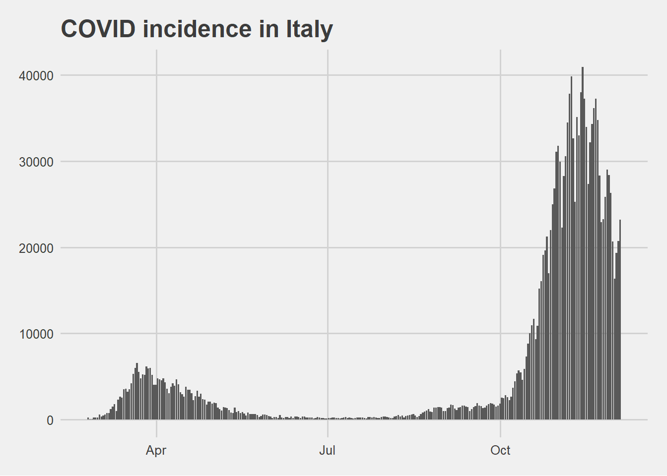
The epi curve above is based on daily reported new cases. This curve highlights a huge difference in number of new cases between the pandemic first wave in spring and the second wave in autumn.
In order to make a sense of this finding it is useful to visualize together with the incidence also the numbers of daily swab tests made.
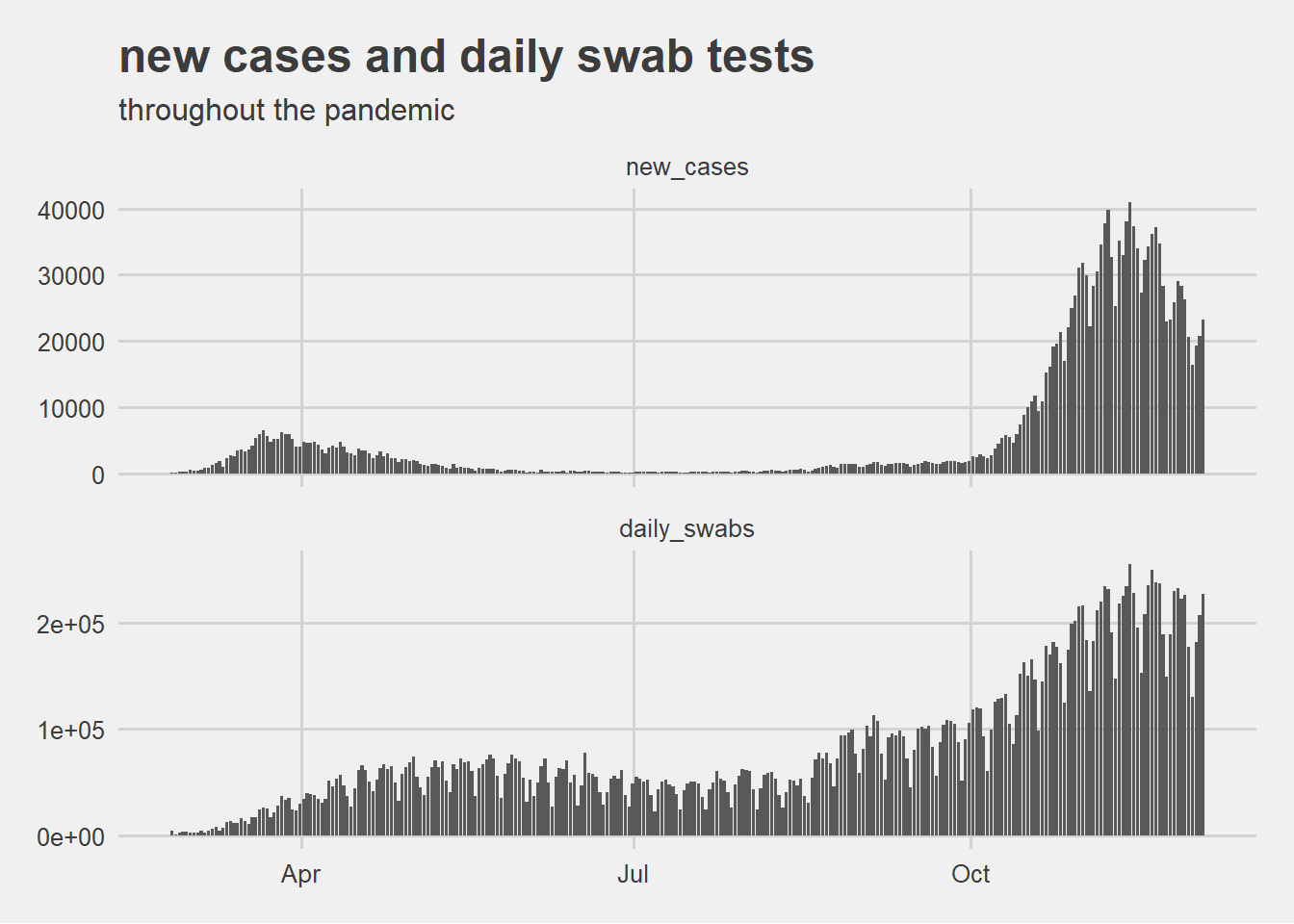
The above visualization suggests that the difference in incidence between the two pandemic waves could be caused by the increased capability of detecting new cases with more daily tests.
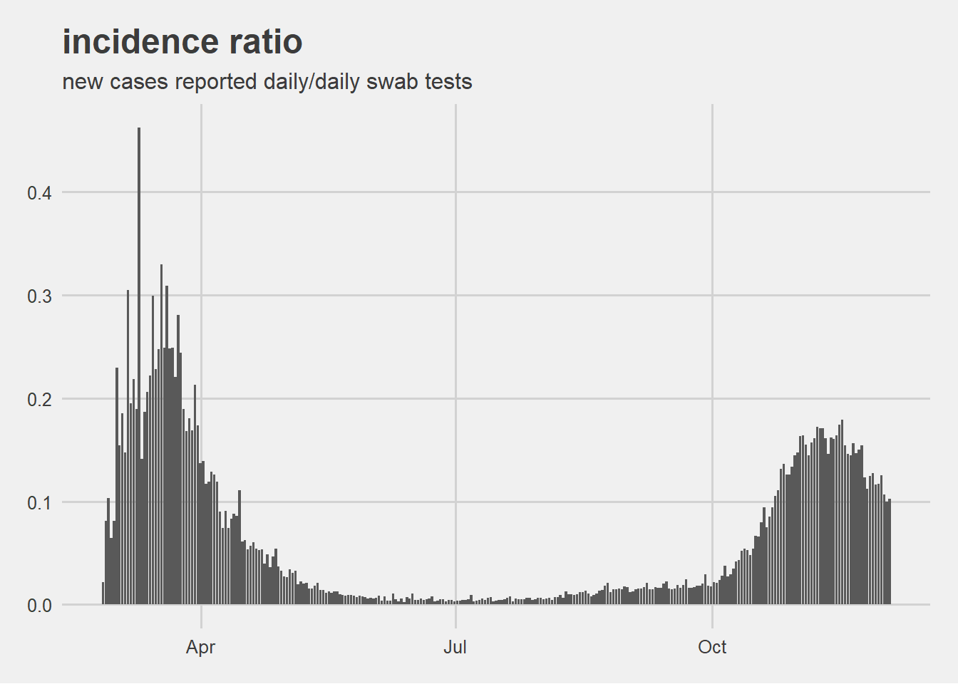
This can be checked visually drawing the ratio between new cases and daily swab tests.
analysis results
the question
is there any difference in incidence between the two pandemic waves?
the proposed answer
the epidemic curve reporting the incidence scaled by swab test show a more comparable trend between the spring and the autnumn pandemic waves.
COVID incidence geo distribution
The above epi curve does not explicit how incidence is distributed across the Italian territory. In order to do this the choropleth maps for Italian regions and for Lombardy provinces have been drawn below on the following dates:
March 15, 2020 at the first wave peak;
April 15, 2020 when the first wave was fading out;
August 1, 2020 between the two pandemic waves;
October 1, 2020 when second pandemic wave started to raise;
December 3, 2020 last day before publishing the post.
Italy cases distribution by region
By analyzing a Italy by region through time, it is possible to verify that in the different phases of the pandemic the infection spread all over the country.
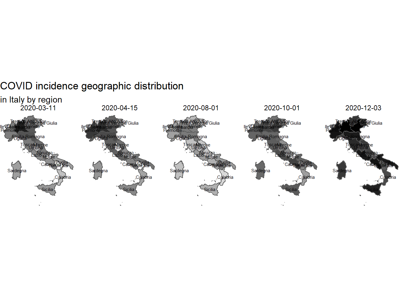
While in spring the most affected regions were situated in northern Italy with Lombardy hit the hardest, in autumn all Italy is affected with more region with high incidence.
The geographic visualization has been produced using the shapefiles provided by ISTAT, the Italian institute for statistics.
cases distribution in Lombardy by province
By analyzing a region, Lombardy, it is possible to verify that in the different phases of the pandemic different provinces are most affected.
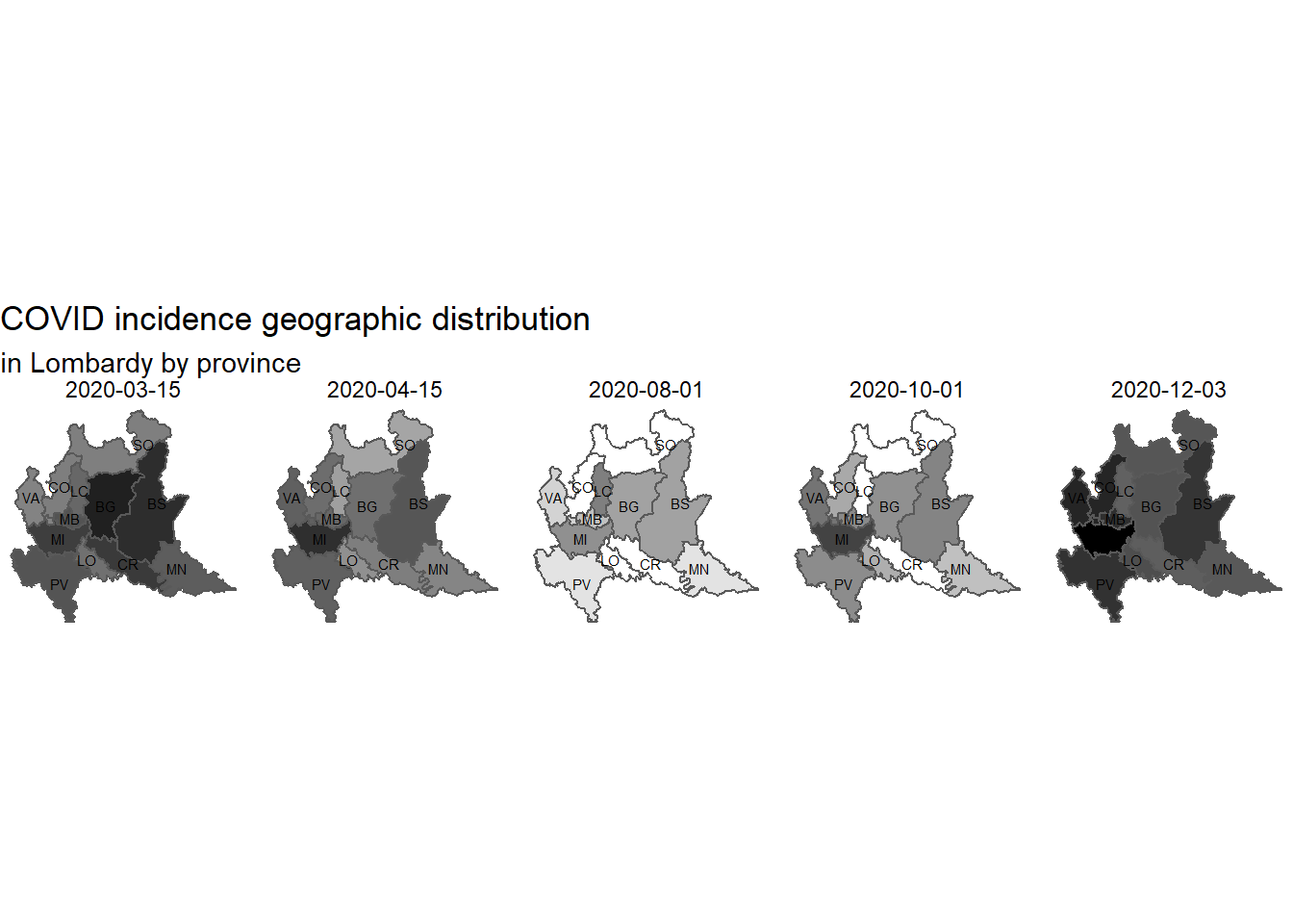 In March Bergamo (BG) was the province hit hard together with Brescia (BS) while in early December Milan (MI) and Monza and Brianza (MB) are the most affected.
In the period of relative pandemic pause only the province of Cremona (CR), Lodi (LO), Lecco (LC) and Sondrio (SO) have almost no new cases.
In March Bergamo (BG) was the province hit hard together with Brescia (BS) while in early December Milan (MI) and Monza and Brianza (MB) are the most affected.
In the period of relative pandemic pause only the province of Cremona (CR), Lodi (LO), Lecco (LC) and Sondrio (SO) have almost no new cases.
The geographic visualization has been produced using the lombardy shapefilespublished in Sergio Ramazzina github.
analysis results
the question
how COVID cases geographic distribution has changed over time throughout Italy and Lombardy?
the proposed answer
COVID pandemic has being moved moving throughout Italy from places where it hitted hard to places less involved in pandemic diffusion before. It could mean that population belonging to a certain territory already hitted by the pandemic could have developed a sort of immunity.
COVID incidence and population density
In order to verify if a relation exists between COVID incidence and population density, the incidence has been scaled according to relative population density. The idea is that if population density is the only factor driving the diffusion of COVID the epi curves should tend to stay in a narrower band at list when the epidemic has spread all over the country. The population density by regions has been scraped from tuttaitalia.it. The relative population density has been computed on the base of the average density for all Italy (199 inhabitants per squared kilometer) so that Lombardy having a density of 423 has a relative density of 423/199 or about 2.126.
northern Italy incidence scaled by relative density comparison
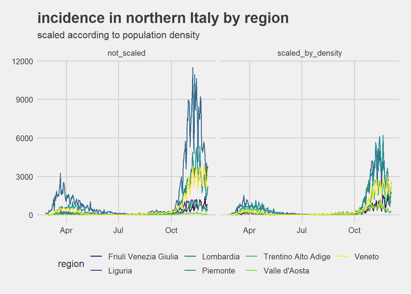
Scaling according to relative population does pushes Lombardia and Piemonte epi curves towards other northern regions curves even if they have still an higher incidence. Furthermore Piemonte seems to reach an higher level of incidence scaled.
central Italy incidence scaled by relative density comparison
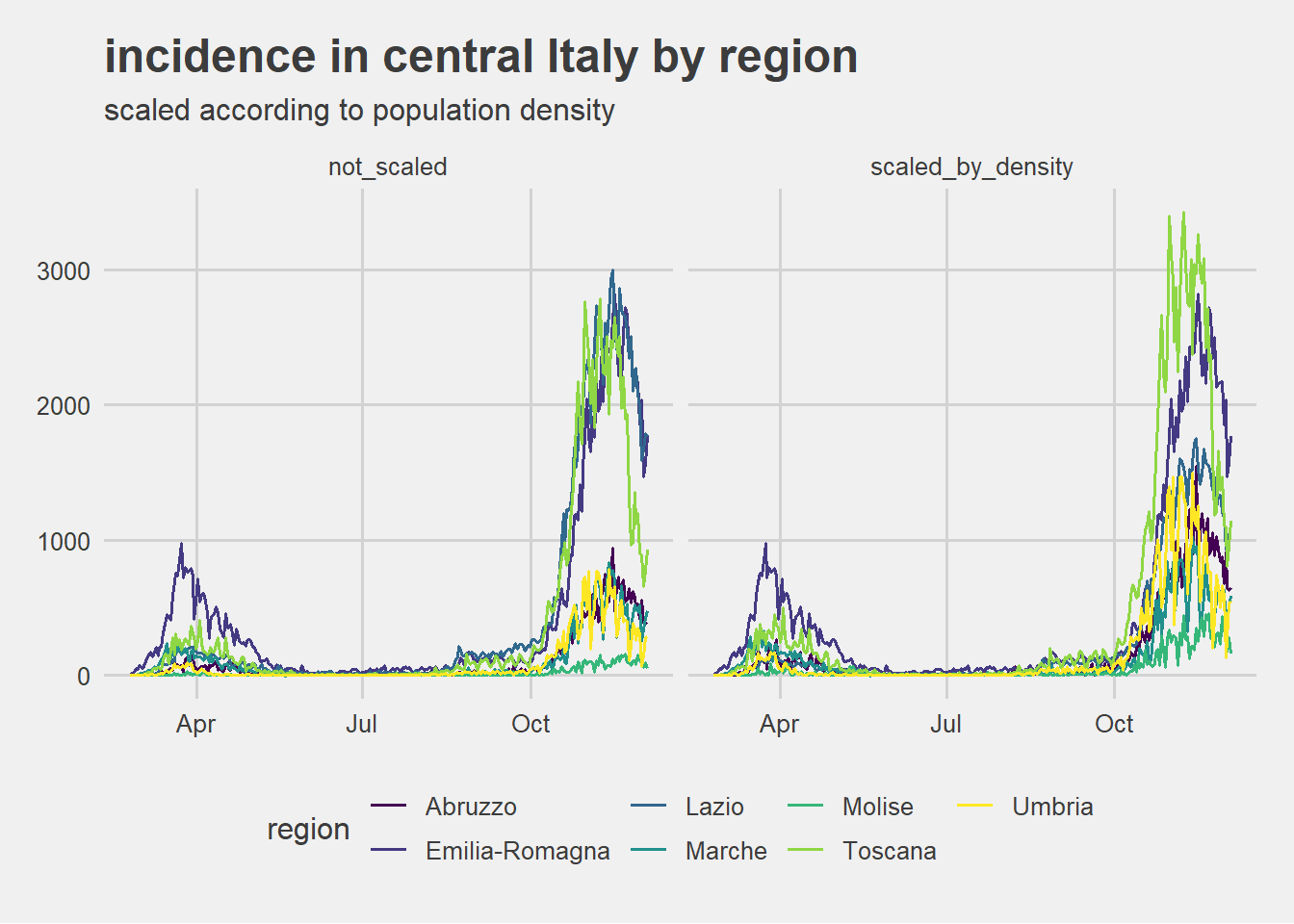
After scaling according to relative population density Lazio incidence seems to come closer to other regions incidence. Epi curves of Emilia-Romagna and of Tuscany instead are not pushed towards other central regions epi curves so that they can be visually considered as showing the same phenomenon intensity.
southern Italy incidence scaled by relative density comparison
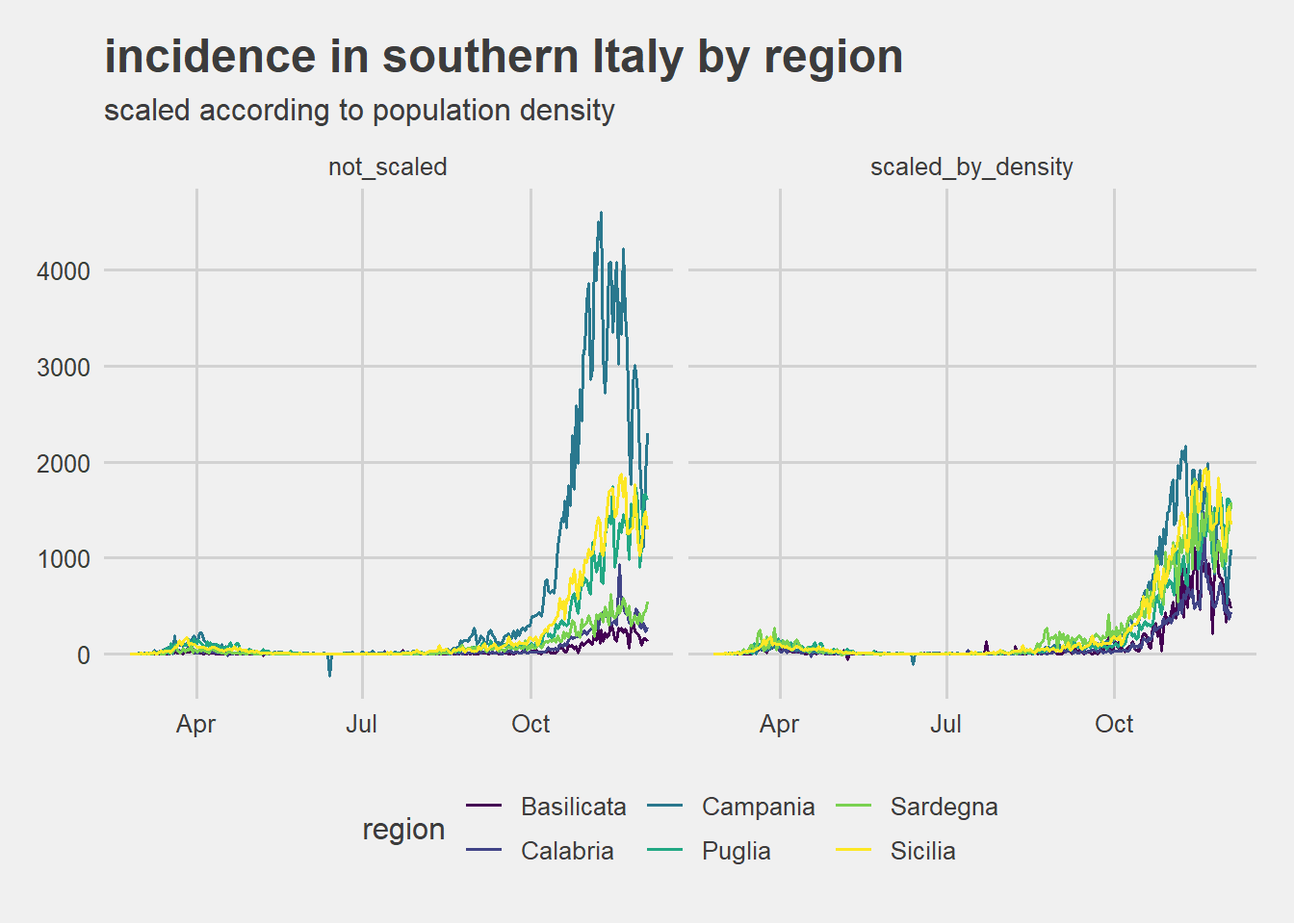 After scaling according to relative population density all southern regions seems to stay into a not so wide band. Only Campania highlights a relatively higher incidence.
analysis results
the question
are differences in incidence by region solely justified by population density?
the proposed answer
From the above visulizations seem that differences in incidence among region aren’t explained only by differences in population density. Epi curves by region show a high variability. In particular for Lombardy, Piemonte in northern Italy, for Emilia-Romagna and Toscana in central Italy and for Campania in southern Italy it seems reasonable to investigate further on how the virus diffusion work. Additional explanatoty variable could be air pollution or social connectivity modality differences among regions.
COVID cases treatment
The official data available specify the treatment modality for COVID cases. These are divided into three categories: hospitalized, intensive care and treated in isolation at home. The chart below shows the amount of cases undergoing the different treatments across the time from the pandemic outbreak through December 3. The amount of treated cases has been square root transformed in order to enable the visualization of cases treated in intensive care.
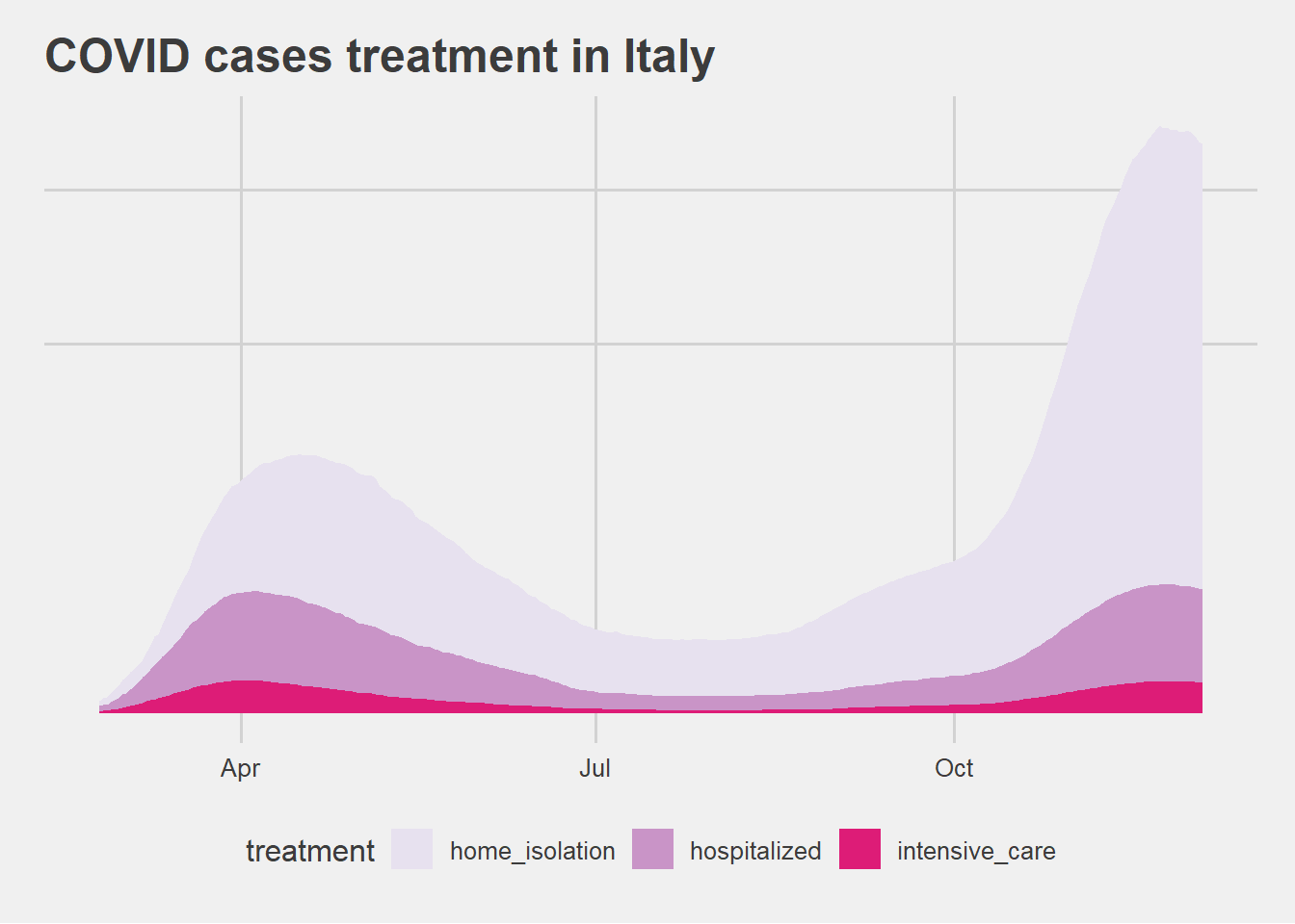
analysis results
the question
Have COVID cases treatments have changed over time?
the proposed answer
The second wave shows a strong increase in cases treated in home isolation. It is not discernible from the data whether this result is due solely to the fact that more cases are detected in the second wave or reflects a change in medical treatment protocols or in severity of cases.
mortality rate
For answering this question the mortality rate has been defined as the ratio between deaths due to COVID and total cases reported \[ mortality\_rate = \frac{cumulative\_deaths}{total\_cases}\] COVID-19 mortality rate for Italy throughout the pandemic period is visualized below together with the numerator and denominator of the ratio.
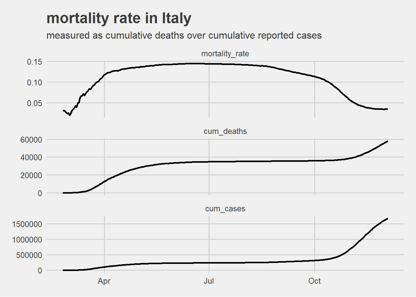
This visualization highlights that the drop in mortality rate between the first wave in spring and the second one in autumn is given mostly by the exponential rise of detected new cases at the denominator (due also to the increased screening capacity).
The mortality rate as computed seems therefore more reliable in the second wave.
The following graph displaying the mortality rate range for each region considering only the data from October 1 to December 3 2020.
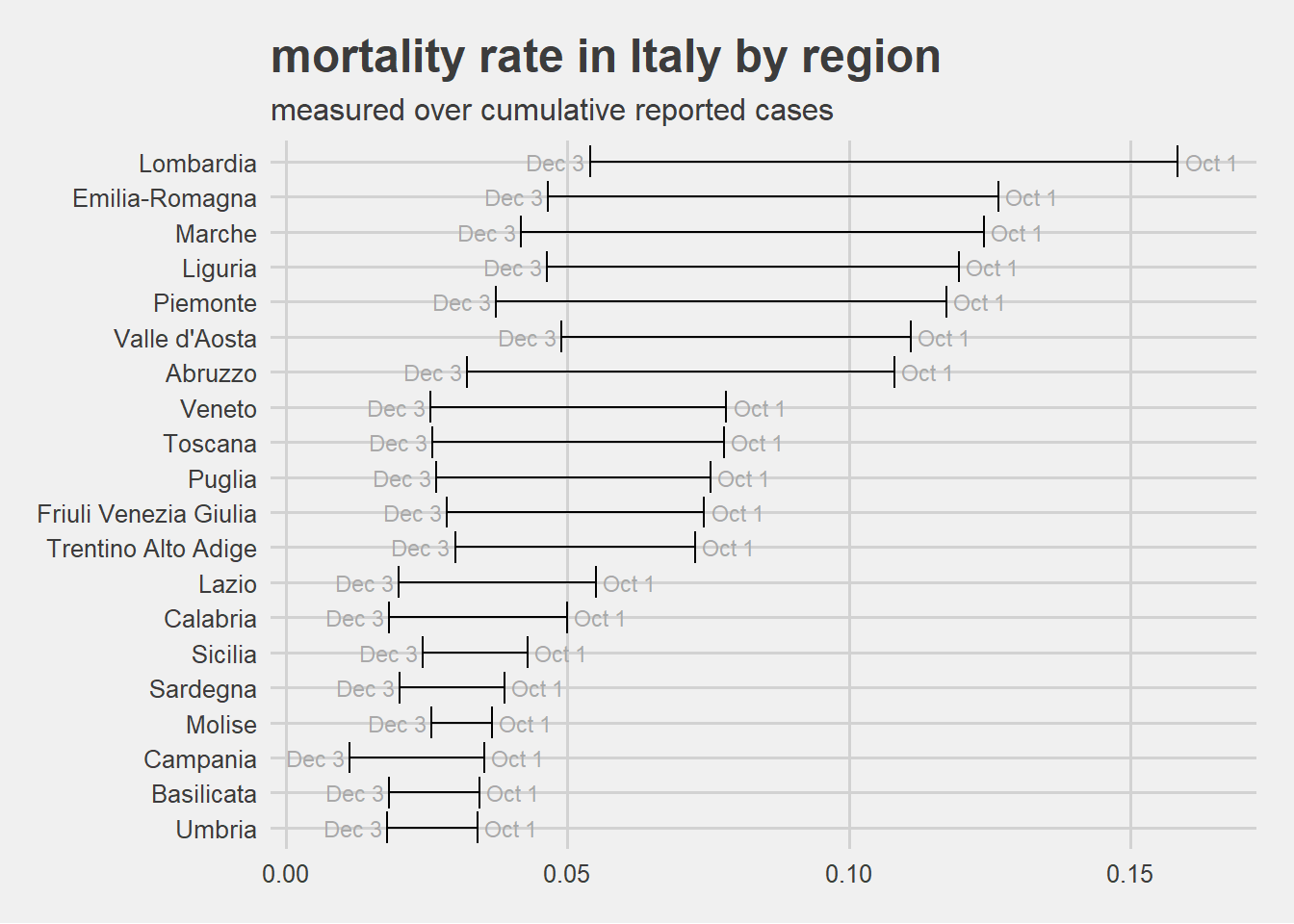
For all regions the mortality rate dropped from October to December but the relative ranking has not been kept constant among all regions.
analysis results
the question
is there any difference in mortality among regions?
the proposed answer
From the visualization above it is reasonable to say that there are significant differences in mortality rate depending on the Italian regions. From the analysis nothing can be said about the causes. The data evidences suggest only further investigation.
\(R_t\) effective reproduction number trend
\(R_t\) is an epidemiological indicator driving governmental decisions and directly impacting the life of the author and of everyone else in this world living in a state imposing restrictions due to COVID-19 pandemic. It is therefore worth trying to understand what \(R_t\) actually is.
The reproduction number \(R\) could be defined,in simple word, the average number of people each person with a disease goes on to infect. \(R\) is an imprecise estimate that rests on assumptions. It doesn’t capture the current status of an epidemic and can spike up and down when case numbers are low. It is also an average for a population and therefore can hide local variation.
The main variant of \(R\) are:
\(R_0\), basic reproduction number, assumes that everybody in a population is susceptible to infection and does not count new cases produced by the secondary cases. It is used at epidemic outbreak;
\(R_t\), actual or effective reproduction number, is calculated over time as an outbreak progresses and considers how some people might have gained immunity, perhaps because they have survived infection or been vaccinated. It measures the virus’s actual transmission rate at a given time, t.
The actual reproductive number (\(R_t\)) and the basic one (\(R_0\)) are affected by several factors such as:
the rate of contacts in the host population
the probability of infection being transmitted during contact
the duration of infectiousness.
In general, for an epidemic to occur in a susceptible population \(R_0\) must be > 1, so the number of cases is increasing, and for an epidemic to continuing its diffusion \(R_t\) must be > 1 too. In other words if \(R_0\) or \(R_t\) is below one, the epidemic eventually peters out. Above one, it will grow, possibly exponentially.
\(R_t\) is computed from the daily incidence data assuming a certain serial interval distribution. The serial interval of COVID-19 is defined as the time duration between a primary case-patient (infector) having symptom onset and a secondary case-patient (infectee) having symptom onset. Since the distribution of COVID-19 serial intervals is a critical input for determining the effective reproduction number (\(R_t\)) and the extent of interventions required to control an epidemic. In the following computations incidence data used as input are the new positive independently from medical treatment and serial interval distribution has been set according to the research letter Serial Interval of COVID-19 among Publicly Reported Confirmed Cases and precisely as a gamma distribution with mean = 3.96 and standard deviation = 4.75.
Note that ISS, Italian higher health institute, computes \(R_t\) in a different way see [FAQ about \(R_t\) computation] (https://www.iss.it/primo-piano/-/asset_publisher/o4oGR9qmvUz9/content/faq-sul-calcolo-del-rt) from the estimation below (no comparison can be done).
\(R_t\) in Italy
The trend of the \(R_t\) in Italy from the outbreak of the pandemic until early December is visualized below.
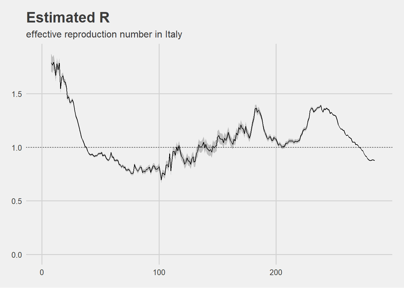
Since the February 2020 outbreak, Rt has remained below 1 for 114 days without dropping below 0.69658 and conversely has been above 1 for 163 days.
Rt in Lombardy
The trend of the \(R_t\) in Lombardy from the outbreak of the pandemic until early December is visualized below.
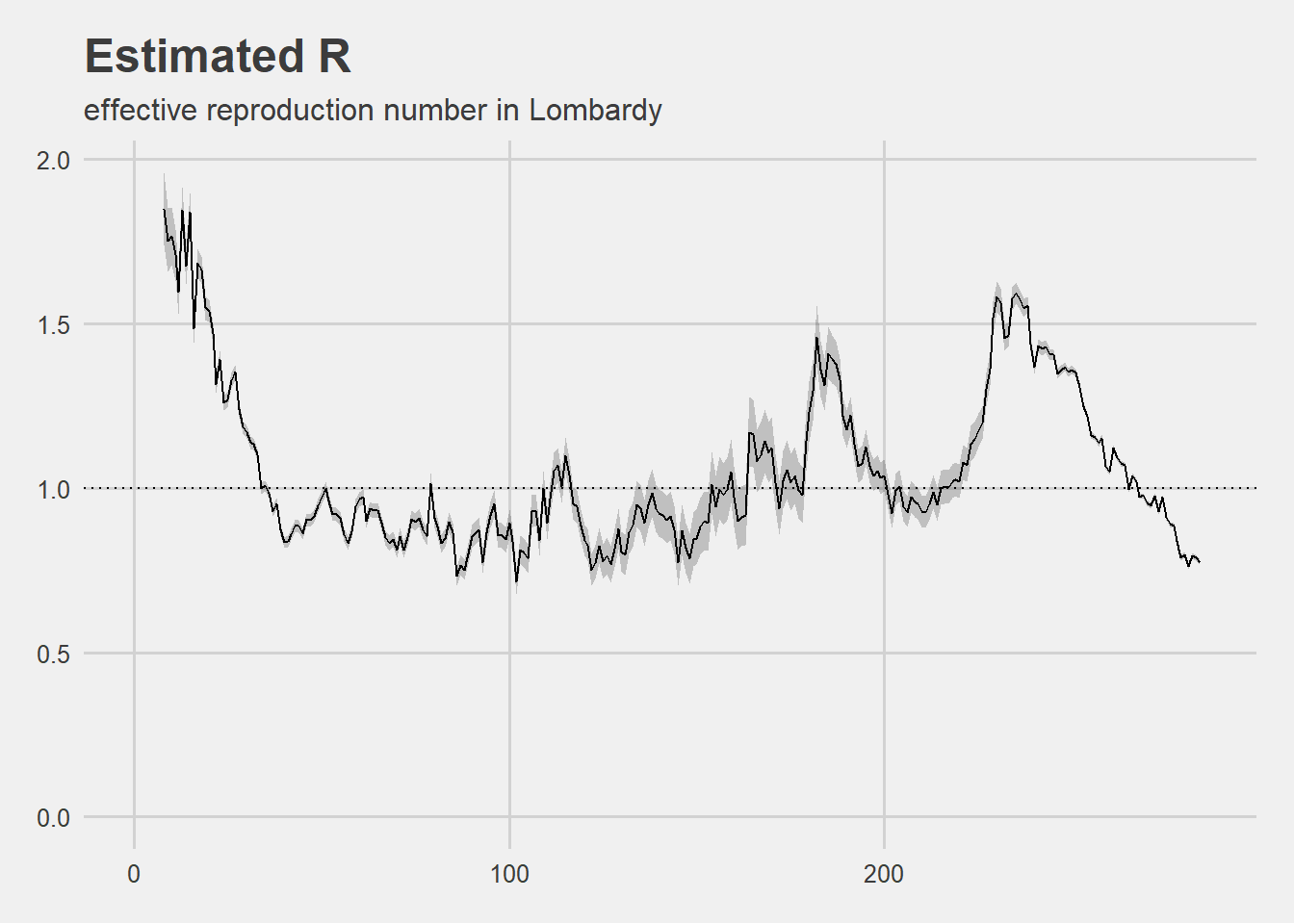
Since the February 2020 outbreak, Rt has remained below 1 for 155 days without dropping below 0.7163284 and conversely has been above 1 for 122 days.
analysis results
the question
Has reproduction number trend ever indicated that the pandemic would have eventually come to an end?
the proposed answer
Given the findings of the above short analysis it is reasonable to conclude that \(R_t\) trend did never indicate that the pandemic would have eventually come to an end. \(R_t\) trend never dropped in a way that could have led to the end of infection but also when it was under 1 it remained stable over 0.69 on average.
final thoughts
As with any serious investigation, many questions arise from each other while definitive answers are missing. This is especially true when analyzing an unexplored field. The strength of a (research) community lies in the courage to go deeper and deeper in search of answers.
Now that this force is hidden by a flood of words in the “communication-verse”, the author hopes that this post could represent a serious attempt to contribute to the understanding of some aspects of the COVID pandemic dynamics in Italy through publicly available data.
The author, who is not an epipemiologist and would not want to be counted among the ultracrepidaries, with this post would only like to encourage everyone to ask questions openly and propose credible or, better, falsifiable answers, even if not above all, on relevant topics and critical problems .
Feel free to email me if you would like to go deeper in the analysis, thanks for reading!
The analysis shown in this post have been executed using R as main computation tool together with its gorgeous ecosystem (tidyverse included). In particular \(R_t\) analysis relied on EpiEstim package.